If your site or developer docs show code, the syntax highlighting is probably failing accessibility contrast checks, because popular dark themes favor style over legibility. On our own blog, Hugo’s default theme failed WCAG AA on 10 of the 12 posts that contain code. For anyone who must meet WCAG, or sells to buyers who check, that’s an audit finding in every code sample.
The threshold
WCAG 2.2 success criterion 1.4.3, Contrast (Minimum), requires a contrast ratio of at least 4.5:1 for normal text and 3:1 for large text. Large text means at least 18 point, or 14 point bold. Code blocks are almost always normal-size text, so 4.5:1 applies to every token color against the block’s background. The only exceptions are for incidental text, such as decoration or disabled controls, and logotypes. Highlighted code is neither.
What failed
Hugo highlights code with the Chroma library, and its default style is monokai. Monokai draws JSON keys, operators and HTML tags in pink, #f92672, on a #272822 background. That’s 3.92:1, under the 4.5:1 line. Comments, in #75715e, come in at about 3:1. Other tokens also failed.
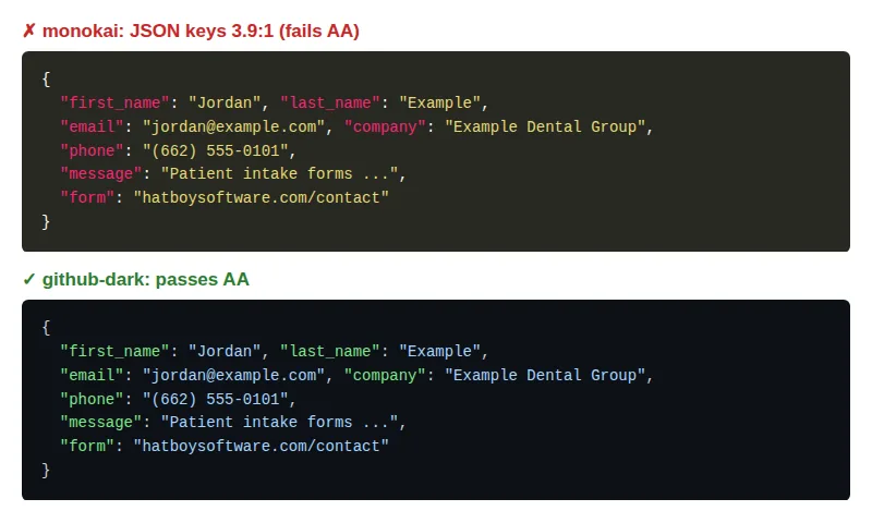 One JSON block from our blog, built with each style. axe-core flagged all seven keys under monokai and nothing under github-dark.
We ran axe-core, the open-source accessibility engine, against every built post. It flagged 10 of the 12 posts with code.
Choosing a replacement by testing it
Theme previews tell you nothing about contrast, so we tested. We rebuilt the site with each of nine built-in Chroma styles and ran axe against every post with code:
| Style | Passed on every post |
|---|---|
| monokai (default) | No |
| native | No |
| dracula | No |
| github-dark | Yes |
| nord | No |
| onedark | No |
| solarized-dark256 | No |
| xcode-dark | No |
| rrt | Yes |
Darkness isn’t the problem: github-dark is a dark theme too. The failures come from saturated accent colors and deliberately dimmed comments, which make code look calm in a screenshot. Comments are where the explanation lives, so they’re the worst place to lose legibility.
Only github-dark and rrt passed everywhere, and we chose github-dark. The change is one line of configuration:
[markup]
  [markup.highlight]
    style = "github-dark"
Test against your own content. Which styles fail depends on which token types your posts actually use, so a theme that passes on JSON-heavy posts can still fail on shell scripts.
The second trap: code the highlighter can’t parse
Not every failure was the theme’s fault. One block failed for a different reason.
The block showed a raw HTTP request: a request line with a {token} placeholder in the URL, headers, and a JSON body, all under one language tag. When Chroma’s lexer for a language can’t parse the input, it doesn’t fall back to plain text. It renders what it can’t parse as error tokens, and here that was the whole block. Under monokai, error tokens are #960050 text on a #1e0010 background: 2.27:1.
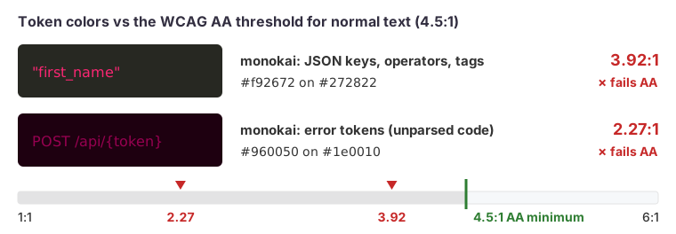 Both monokai pairs fall short of the 4.5:1 minimum for normal text; the error-token pair by a wide margin.
That’s two problems in one. The contrast fails, and the block loses its highlighting entirely. Neither is obvious if you only check that the page renders. A theme change can fix the first: github-dark draws error tokens at about 5.6:1. It can’t fix the second.
The fix was to split the block in two: the request line and headers in a text block, which Chroma doesn’t try to parse, and the body in a json block, which it parses well.
POST /api/v1/<resource>/<token>
Content-Type: application/json
{ "name": "<name>", "email": "<email>" }
If a highlighted block suddenly looks like one solid color, the lexer probably gave up. Placeholders such as {token} and <name>, made-up syntax and ellipses in the middle of code are the usual causes.
How to test it yourself
Run axe-core with Playwright against the built site, scoped to code blocks, so the results aren’t buried in other findings. Build first, then serve the output locally:
hugo --minify -d public --baseURL http://localhost:8080/
python3 -m http.server 8080 --directory public
Then a Playwright test that visits each page with code and runs only the contrast rule inside pre elements:
import { test, expect } from '@playwright/test';
import AxeBuilder from '@axe-core/playwright';

const pages = ['/blog/<post-with-code>/', '/blog/<another-post>/'];

for (const path of pages) {
  test(`code contrast: ${path}`, async ({ page }) => {
    await page.goto(`http://localhost:8080${path}`);
    const results = await new AxeBuilder({ page })
      .include('pre')
      .withRules(['color-contrast'])
      .analyze();
    expect(results.violations).toEqual([]);
  });
}
A few practical notes:
- Test the built pages, not the theme preview. What matters is the colors your content actually uses.
- Generate the page list from your sitemap or search index, filtered to pages that contain
pre, so new posts are covered automatically. - Run it in CI on every change to content or configuration. A new post with a new language can bring in a new token type and a new failure.
- Run a full axe scan too, at desktop and phone widths. Scoping to code blocks is for diagnosis; it doesn’t replace checking the whole page.
Why this deserves an hour
Contrast failures in code blocks are easy to dismiss as cosmetic. They aren’t. Readers with low vision, people on a laptop in sunlight, and anyone reading a projected screen in a meeting all hit them. Automated scanners and accessibility audits find them on the first pass. The fix is cheap: one configuration line and a test that keeps it fixed.
How we can help
We audit and fix accessibility, performance and reliability problems in sites and apps, and we leave behind automated checks so the fixes stay in place. If your product needs to meet WCAG 2.2 AA, see our app stabilization service.